SkyZen: Designing a Mobile Assistant for Anxious Flyers
Developing a conceptual mobile assistant to alleviate passenger anxiety through transparent flight data.
Role
UX/UI Designer
Industry
Travel / Consumer Mobile
Duration
72 Hours
IV. Tradeoffs
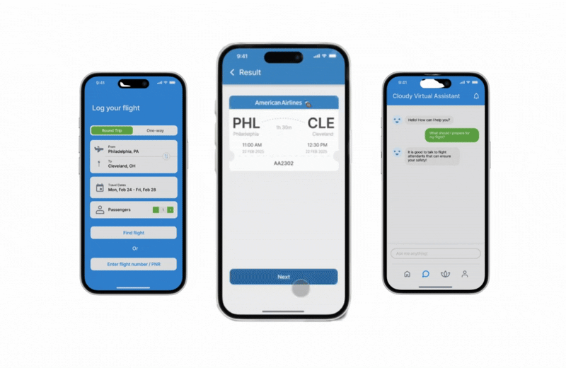
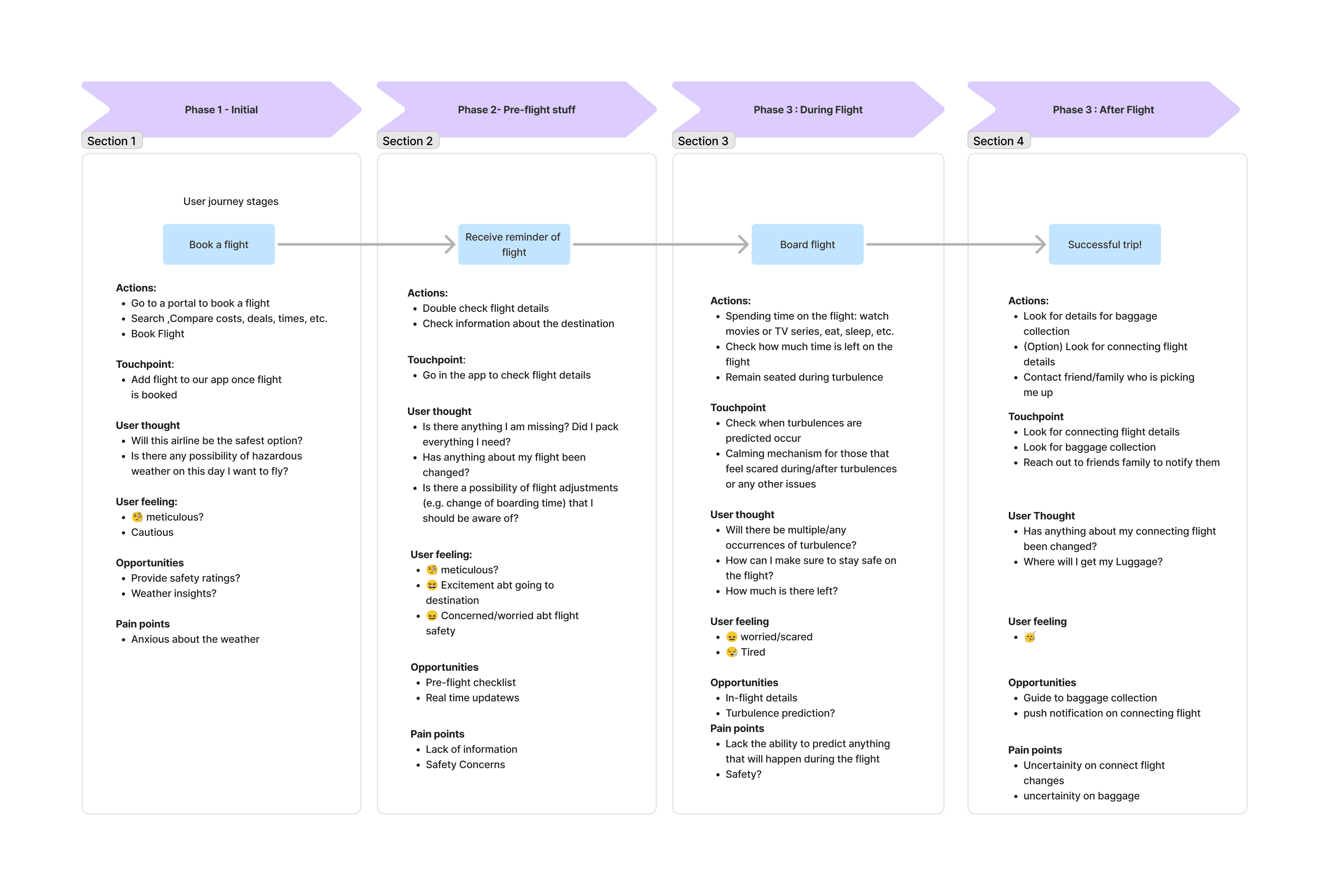
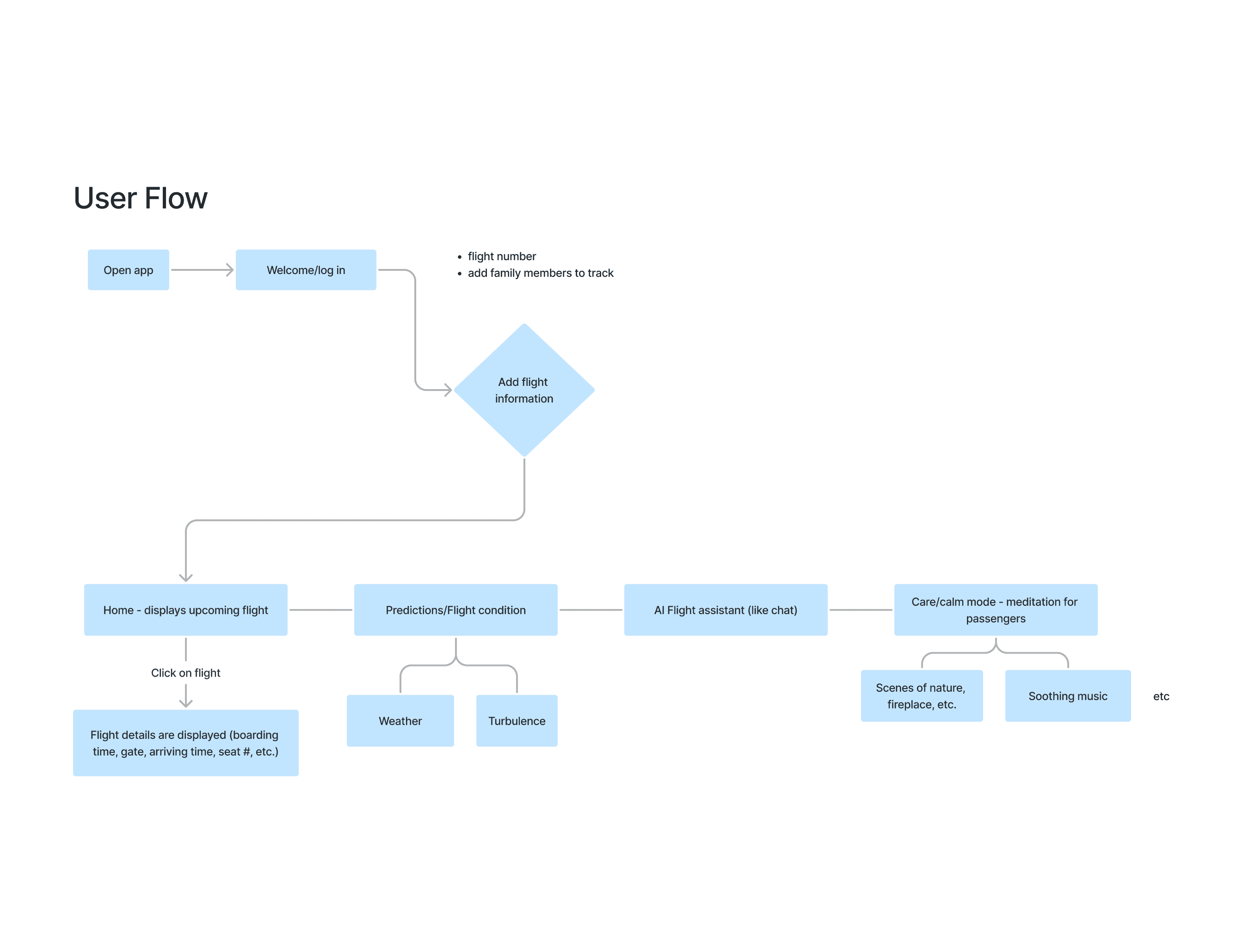
With a limited build window, we treated scope like a design constraint. Instead of trying to cover every possible scenario, we narrowed to the moments that most impact passenger confidence.
Prioritized the core emotional arc: “What’s happening?” “Is this normal?” “What can I do right now?”
Designed Calm Mode as a lightweight, low-friction reset that doesn’t compete with attention during a flight
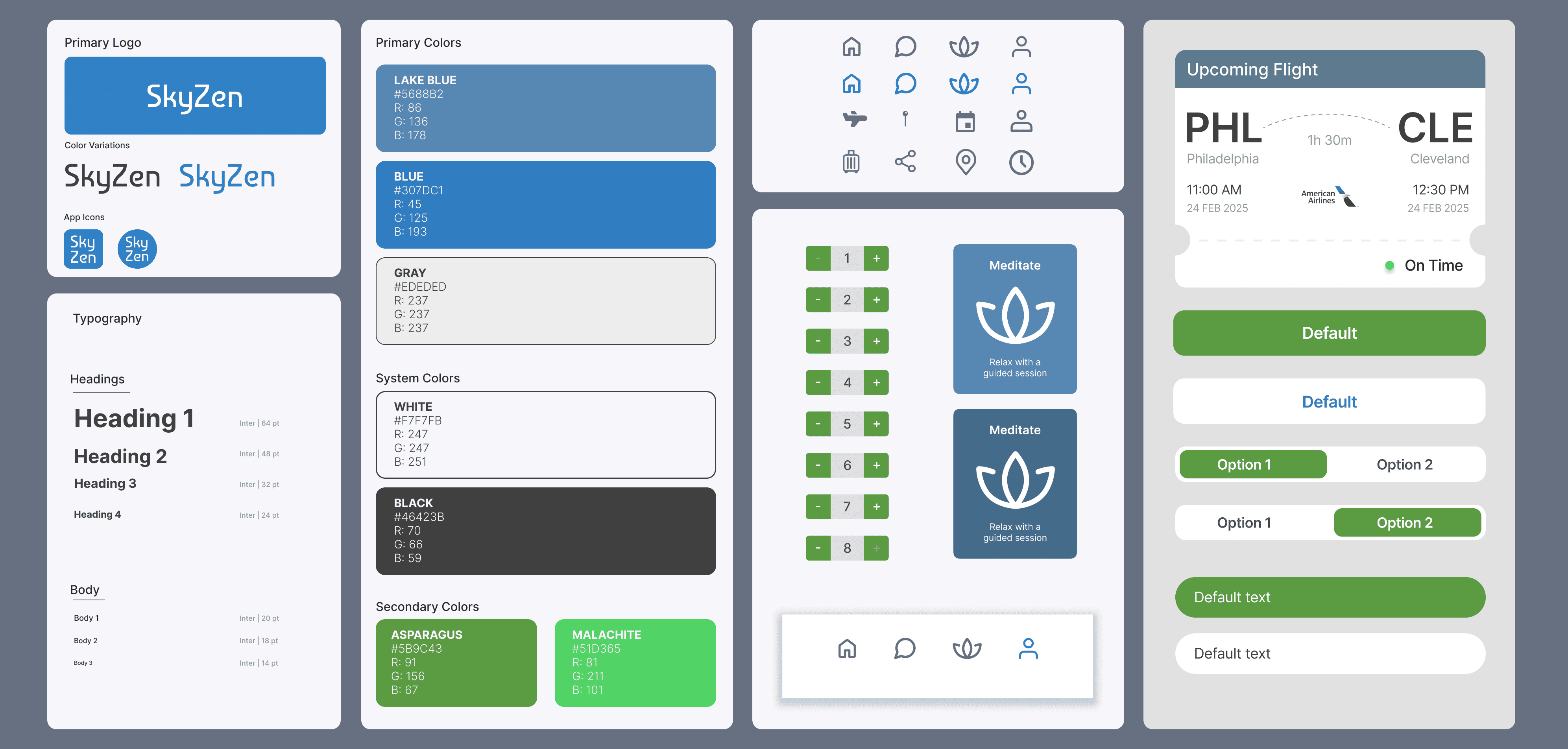
Kept the experience cohesive by shipping fewer features with stronger clarity and polish


Other projects
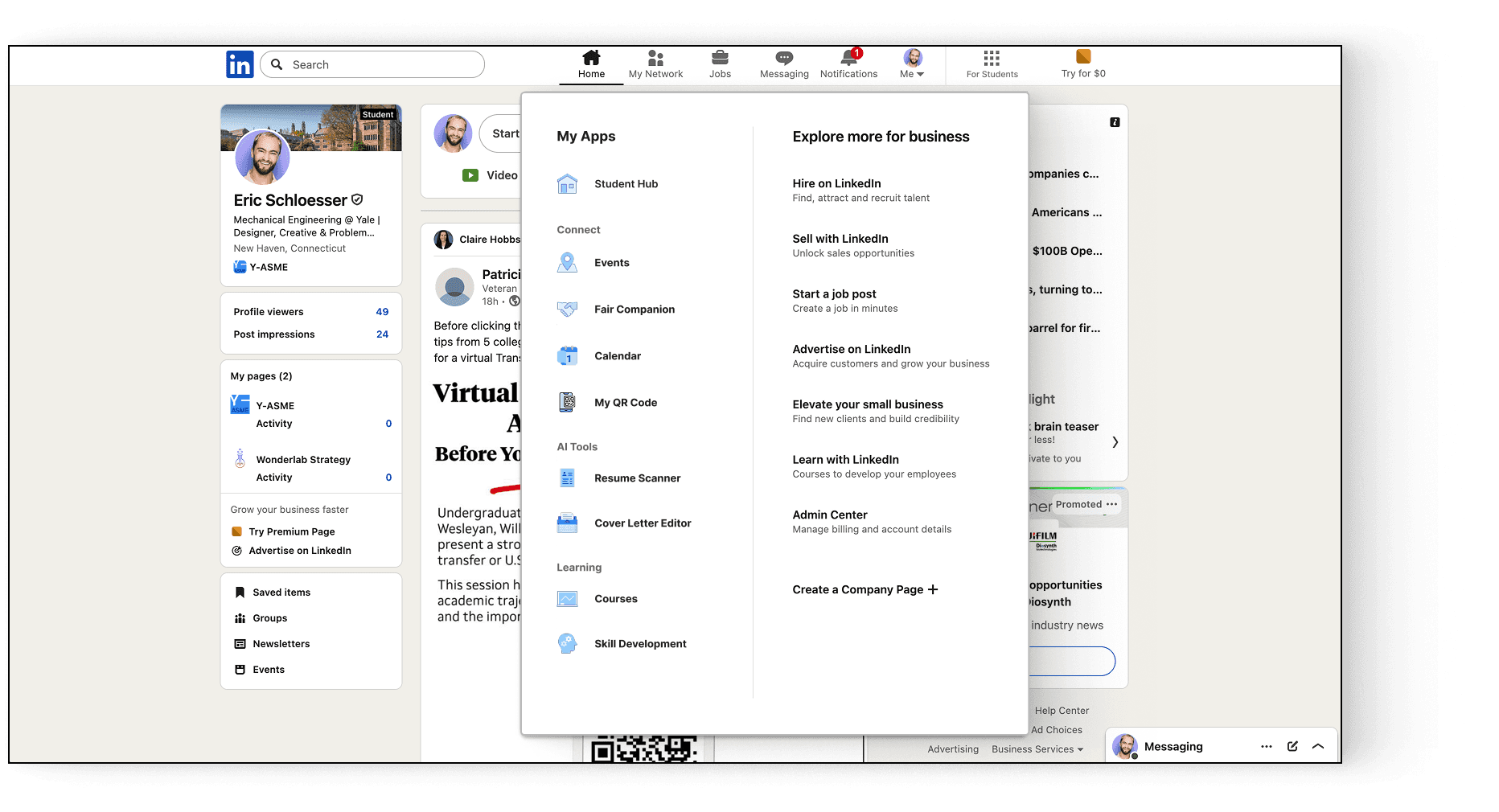
Linkedin: Student Fair Case Study
A career-center partnership pitch for a LinkedIn-native student recruiting fair

Boola Dash: Gamifying the Yale Experience
Designing the user flow and illustrating all custom game assets for a collaborative development project.
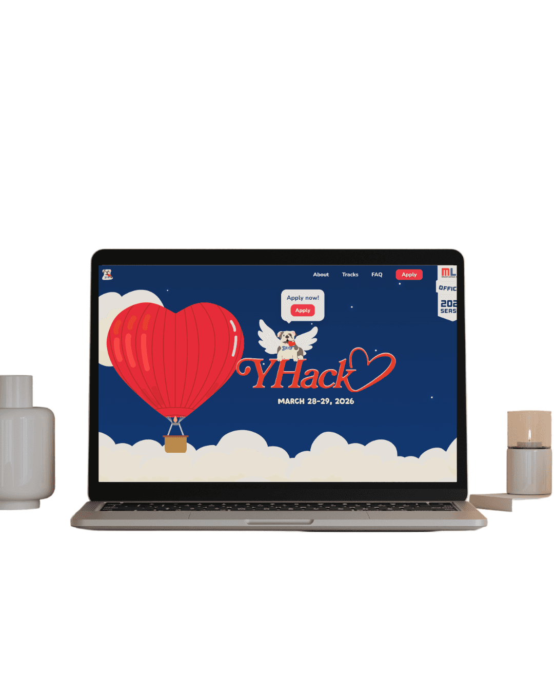
YHack: Crafting the Identity for Yale’s Hackathon
Building a cohesive brand and digital experience for 400+ global hackers.

Ivy Nurse: Revolutionizing the Nursing Shift Marketplace
Designing a two-sided hiring platform for nursing students and healthcare orgs